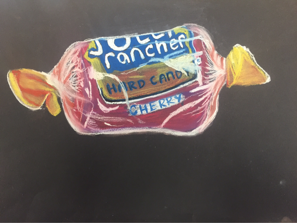
 This is part of the opacity study and I used a cherry Jolly Rancher. To create the candy I added both red and purple to give dimension and value. I added orange and yellow to parts of the label to create shadowing. I had a hard time getting the opacity but I think by following the lines create by the actual wrapper it helped me give the look. I feel like I lack some control with chalk but I am not a fan of chalk pencils so using chalk will definitely take practice!
0 Comments
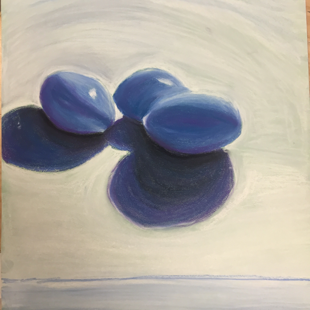 I have not really used chalk before so this is a new experience for me. I like the monochromatic blue I used and the deep purple for the darks and shadows. If i could change anything it would be the eggs shape in a few places. I would love draw more eggs in the future.
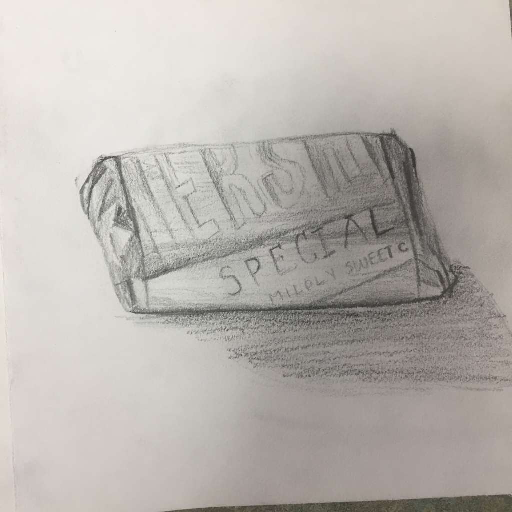 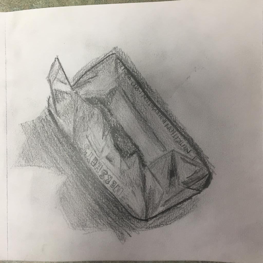 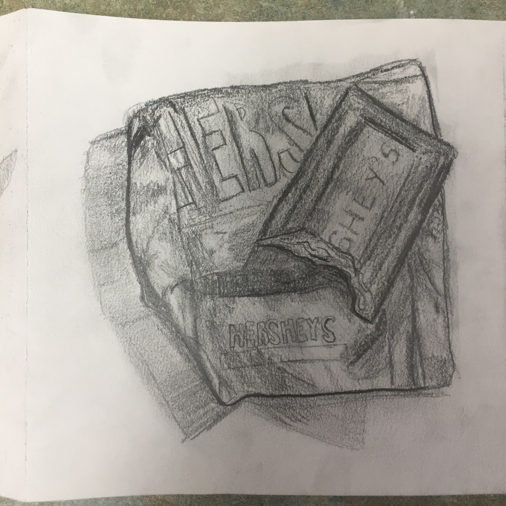 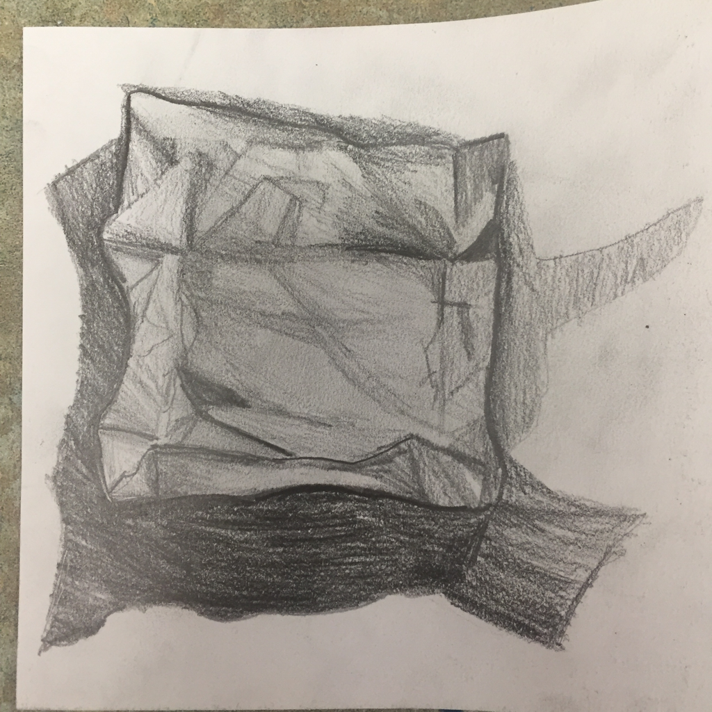 This is my progression of a small Hershey chocolate bar. This project definitely challenged me to use a range of values and to create creases in the wrapper. It was very hard to keep my graphite lines sharp and clean. This project was time consuming but a very cool concept!
Evaluation 1. Explain how value is important in this drawing. Value is crucial to showing the folds and shadows created by the candy wrapper. By using darker values to outline and create shadows I was able to make the drawing sharper. The lighter values show where the light hit certain sections of the wrapper. 2. Describe several challenges that you faced while creating this drawing. What did you do to overcome these obstacles? I did face issues making sure my values stayed sharp. To solve this I went back to add dark values so that the graphite did not grow soft. I also struggled to make the shape of the wrapper look ideal so I had to erase and draw again but pay very close attention to details which helped a lot. 3. How important was it to have clean crisp edges to your wrapper? So so so important. The wrapper itself is made out of a shiny paper that is cut in a rectangle and folded. This alone presses the need for crisp edges. Also since this is progression crisp edges allow for the viewer to see the change from drawing to drawing. 4. Explain how your interpretation of texture is essential in capturing the look of the object. The shiny texture of the wrapper created highlights and forced me to create a smooth look with my pencil lines. The inside was a more dull so the lines were rougher yet blended while still including dark values for folds. 5. Name three things you would draw differently if you were to do this project again. What did you learn from this drawing? a) add more darks in the shadows and make them smoother b) rewrite the lettering and make it sharper c) sharpen the highlights on the shiny part of the wrapper This drawing taught me to pay close attention to detail as well as sharpen value based on the texture of the object. 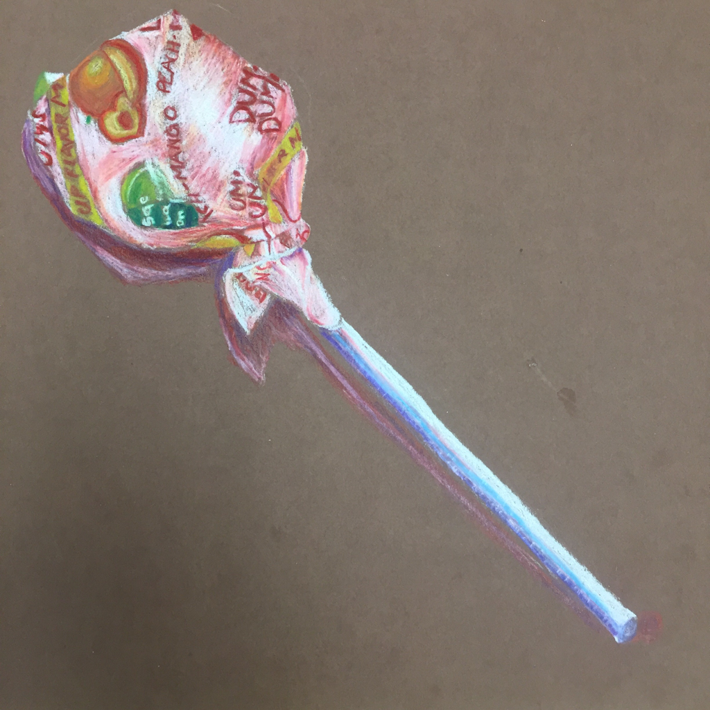 Drawing this Dum Dum was difficult but truly worth it! I was forced to use colors in shadows and places where there are not normally colors. This adds dynamic and makes it pop. Layering started with white then red then orange and it took many layers to get the right colors for the 3 Dimensional look. I definitely learned how to blend and better use prisma colored pencils. 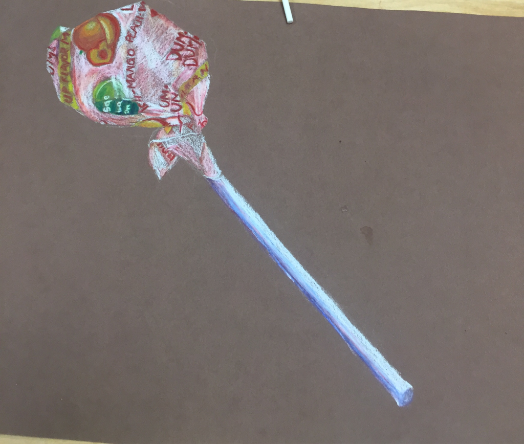 This is my progress it takes a lot of time to get layers of prisma. This experience really taught me patience in art!
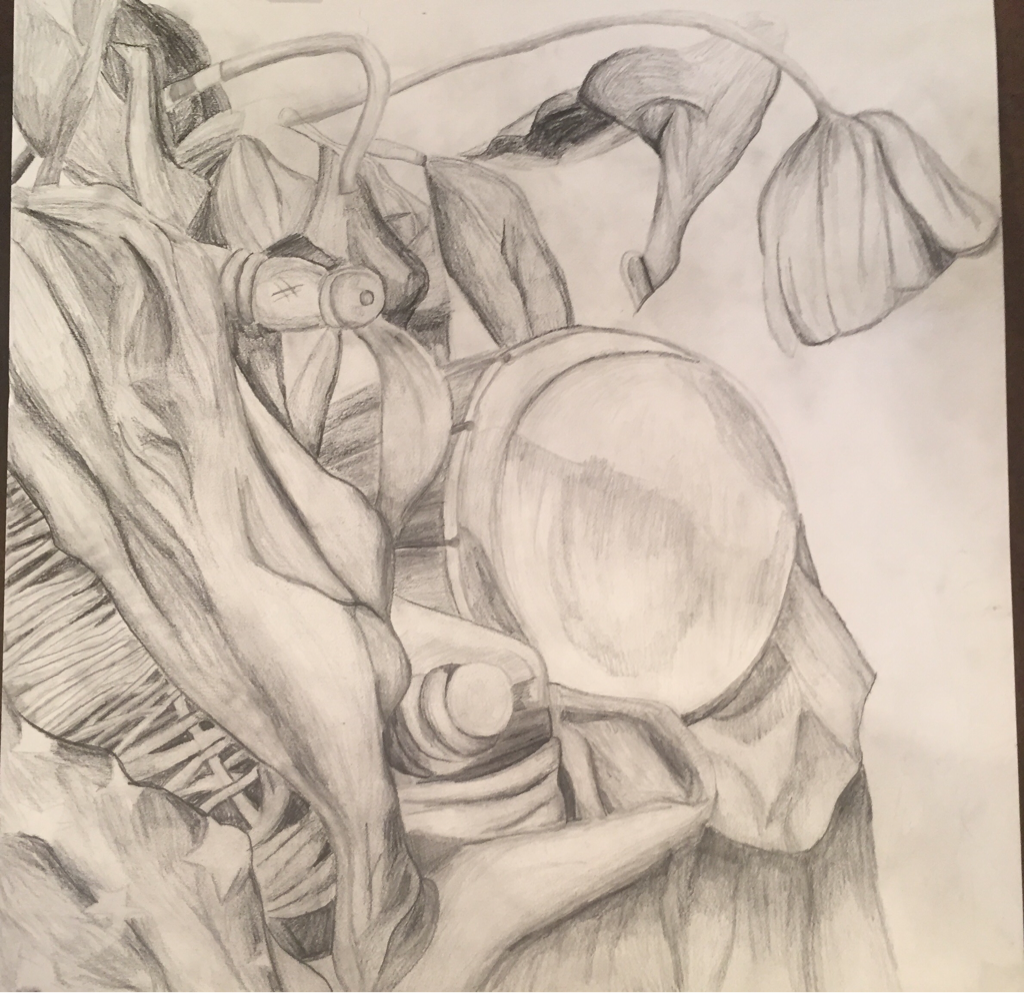 1. Describe the craftsmanship of your drawing.
This drawing has well defined edges and lines as well as clear negative space. The fabric and drum are sharply defined. There are some smudges but they are minimal. 2. Are your values and shadows realistic? How many values did you include? How and why are values important? I used atleast 5 different values in my drawing ranging from close to white to mid tones to dark. I used HB, 2B, and 4B pencils to give a wide range of values so that my drawing looked realistic by including shadows and bends in the objects. Values give objects a 3D effect that makes them interesting and realistic. 3. Is there a clear source of lighting? I did my best to create darkness in corners and shadowy areas but tried to stay lighter in taller and closer areas because that is where the light is coming from. 4. How important were the compositional sketches? Explain. Composition sketches were important in that they allowed me to figure out the best angle for me to draw from. Then I could figure out if the object placement looked right and the overall look of my piece. 5. How is your final drawing successful? My final drawing is successful in that I used value to create dimension and negative space to add interest and realistic elements to the piece. I am overall very proud of this piece. 6. Are the proportions, structure, and perspective of the subject correct? To create proper perspective I gave the drum a more oval like shape and made the basket with fabric closer to me. I feel like the tea pot handle may be a bit proportionally off too but I believe overall the proportions, structure, and perspective are correct. 7. Does the placement and grouping of objects create a pleasing arrangement (composition)? The way I chose the composition was because due to the different objects and their placement. I feel the composition created strong negative space and draws your eye to the different objects. 8. Is there a center of interest and is it well located? The drum is the center of interest. The fact that it is not quite in the middle I think adds to the interest. 9. How well did you manage your time and resources throughout the process of creating this drawing? Do you see where you could improve in this area? I feel like I managed my time well but I could have spent more time on the leaves and adding value. 10. What challenges did you encounter during this project and how did you overcome them? Drawing everything was a challenge but especially the basket and the leaves. These both took patience and careful attention to the details of the objects in real life. Getting the right shape and texture is so important. 11. What have you learned drawing a still life? Drawing this still life has taught me the importance of composition and value. The composition means so much when making your piece interesting. Blending all nine shades of value will give you a much better outcome than only using some of the values. |
RachelI am not great at art but we all try right? Archives
May 2016
Categories |
 RSS Feed
