|
What a semester. Art 4 has truly been one of my favorite classes at Apex High School. I am so blessed to know and have worked with amazing artists in this class. Their input has helped me tremendously in making better art. This class has taught me so much more about my art skills and the art I made is better than anything I thought I could ever make with my own hands.
Thank you so much Ms. Rossi. You taught me so many new things about art and my abilities. You challenged me to become the best artist I could be even when I resented the prospect of it. I want to take a few art classes in college now because of your class. I'll be back to visit. Keep inspiring people like me Ms. Rossi. I am forever grateful.
0 Comments
Okay so when I first started this bubble gum machine I was so overwhelmed. It required a lot of deep and vibrant colors and intricate shapes. I was excited because I feel like every time I make another piece using prisma colors I improve my skills. I was officially ready to take on this challenge.
To begin, I got the basic outline of the shape of the gumball machine. This was so hard because the machine itself is very close to being perfectly symmetrical but the gumballs inside threw me off. So I basically avoided the gum in the machine. I worked instead on the red metal part. I love this part of the machine. I add so many layers and I worked very hard to include a wide range of values. I love the way it shines. After adding a few layers of red I moved onto the gumballs. The gumballs took me a very long time. First I started out at the top, slowly adding the gumballs in below it. Getting the circles to have a realistic shape took a while. It was hard to find a way for all the gumballs to fit together. It felt like I was drawing a puzzle. Then I began adding color. My goal was to capture the vibrancy of the gumballs. This helps make the mood of the piece light and fun. I went to work starting with a base color then added shadows and highlights. I think this was one of my best pieces in terms of value with prisma colors. It took me a very long time but I finally colored all of those gumballs. I counted. There were 64 gumballs visible. Next was the part I really dreaded, the coin slot. I really did not want to capture all the detail in the picture because I did not want the eye to be drawn into the center too much. Instead, I tried to add the values I saw. I avoided to many detailed shapes of what looked to be animals. This worked in my favor in that I was able to create the look and maintain a balance throughout my piece. If I had more time, I would go back and add even more color to the gumballs. This would make this piece even stronger. If I redid the piece I would add more colors because I think that the orange and yellow look too similar. I was overall happy with the way this piece turned out. I think it only helped improve my skills as an artist no matter how frustrating it may have been. Mixed media is definitely a form of art that I am not very familiar with. I have done one other mixed media piece but that was all. I was really excited for this piece because it is a different form of art. It is abstract and interpretative while still maintaining a theme and creating lines and shapes. Mixed media involves both 3 dimensional material and flat material like newspaper and tissue paper. Mixed media is almost relaxing as you add the layers of gel medium and media.
To start, I knew I wanted to use blues. Blues are peaceful and to me, convey a sense of calm. So I added different shades of blue and a little bit of light green. Then I added newspaper. I decided to add in the playing card with glitter which I think is very strong and added a vertical line. When I added the playing card, I noticed the way red adds a new dynamic to the piece. I became inspired. I realized that the blue reminded me of the ocean and red reminded me of royalty and nobility. When I was searching through maps for more layers I found one with Hawaii. This was perfect. I have always dreamed of visiting Hawaii one day. I am in awe of the clear water and white sand beaches. The volcanoes and lava add a twist to this American paradise. Maybe it was my love for Hawaii Five-0 that sparked this interest. I have no idea. But this piece was a perfect way to embrace the inner tourist in me and explore the rich history of this once independent island civilization. I actually found out Hawaii had a queen, not a king (oops). The native polynesians actually sailed 2000 miles on canoe before finding the Hawaiian islands. You may wonder why I included a piece of a European map. Europe actually had a major impact on the Hawaiian way of life and opened the island up as a trade stop for seamen and whalers. Anyway, my passion for the island life helped influence my use of materials. I included a map of Hawaii along with Hawaii in red. I still covered some of this with tissue paper to better enhance the piece. I included a red bird that is actually native to Hawaii along with a hibiscus flower. I then use acrylic paint to add waves. I tried to incorporate circles throughout my piece as well. I used acrylic paint and bubble wrap to add the circles on the top and bottom of my piece. I added the red 3 dimensional circles on the wire to add red and create a horizontal line. I also tried to use repetition throughout my piece. I cut pieces of magazine to make diagonal lines. These were darker blue but had fish on them. This helped add the sea life of the state of Hawaii. I am overall happy with the way this piece turned out. It has meaning and every piece I included can tie back to the native way of life. I would like to go back in and add some more to this piece to create more interest, especially in the middle area. I enjoyed doing this project at the end of the semester. My oh my. This was one of my very first landscapes and it was incredibly challenging. I have limited experience with watercolor so this was a piece that involved trial and error. I am actually not too disappointed in the way it turned out for one of my frist watercolor pieces.
I got the picture from one of my close friends, Carissa, who moved up to Asheville this fall. I miss her so very much so I when I needed a landscape idea I thought of the beautiful mountains in fall up where she lives. The changing colors of the leaves are a signature part of the mountains of North Carolina that I wanted to capture. I knew I wanted to paint this but I was debating between mediums. I think watercolor was an appropriate way to capture the lake and colors of fall. To begin, I worked in my sketch book and I immediately knew how difficult working with watercolor would be. Just getting the color you want and the right amount of water while preventing over blending and pilling on the paper. I really wanted to be able to use both very light watercolor and pure watercolor paint. I knew that was the only way to get the depth I wanted. I also chose a very large piece of water color paper. I wanted to make sure it was large enough to get the full effect of the water colors. I also tried to effectively capture the composition and the rule of thirds that I used. I knew I had to work in light layers, which I tried to do throughout the water. However when I got to the trees the color was more concentrated than I thought. To compensate for this I added water and tried to make the leaves look realistic along with the shape of the tree line. I added purple to the mountains to make them stand out more against the trees while making them still appear in the background. After that, I added in the dock. The dock was incredibly difficult. I had a hard time capturing the shadows and the correct shape of the wood. I moved on to work on the branches, I think I got the shapes and snags of the branches well. Stay tuned for a break through... Then, the amazing Hannah from last year visited out art class. I was honestly embarassed to show her my piece because I have seen how great her work is. When she saw it she immediately knew what I need. More darks. She told me that this will get the dock and tree branches from looking like they are in the water. Can I tell you she was so right! It turned my piece into a much higher quality piece of art. I transformed the landscape into a more realistic painting. I think this is a piece I could go back and add to but I also think it is one of the most improved pieces I have done this year. I really wanted to just quit but I stayed persistant. I think this piece taught me a lot about myself as an artist and showed me that I am capable of trying new things and succeeding. This first one may have not turned out to be the best piece I have done so far but it shows me it is doable. I am so thankful for the encouragement I recieved from people at my table and everyone around me. I can honestly say this has probably been my favorite art class. This piece is of my pal Calli who runs cross country at Apex High School. During one of her meets, I captured a great picture of her running down the home stretch to the finish line. I wanted to take this picture and turn this moment into a piece of art work. When I found out that the piece we had to do coming up was nature turns mechanical I immediately knew this is what I wanted to draw. I wanted to get the colors right so I decided to work with prismas.
This was the first time I had ever drawn a human body and boy was it hard. Getting the proportions of the body right took many tries. I have to say, I gave Calli a bubble butt at first yikes! With the help of my awesome table group, I was able to figure out how to make it look more like her body in the photo. Once I finally got the proportions right, I had to add mechanical aspects to the piece. Since runners can be "super human" I wanted this piece to embody the strength of a runner. I wanted to make her knee and elbow joints stick out so I chose gears and hinges.Then I added metal rods for the bones and wires to be like the muscles. It was so hard, but I tried to add silver, purple and blue to give the metal value and depth. Then I started added color to make her jersey. Apex colors are black and gold but I did not want to use black because values would be hard. I choose dark blue and purple with some black in the very dark spots. I then mimicked the color and shape of her tennis shoes. I wanted to make this as close to the picture as possible. This was important to me because I know how much values runners put into their running spikes and shoes. Each person has something unique about their pair. I wanted to capture the wrinkles in her clothing. Then I moved onto skin which has always been hard for me. First I made the skin too pale but then I added values which helped a lot. Throughout the whole piece, I feel like I maintained my style. In the skin as well as the grass and tent I kept my textured style I use with prismas. Sometimes I get discouraged when everything is not as smooth as other peoples prisma drawing but then I get excited because I see my own unique style developing. After finishing most of her body, I moved on to the lettering of the banner. I have not done much lettering before so I worked very hard to make it look as precise as possible. It took a few tries to finally get the right shape and size to the letters. I am really happy I tried lettering on this piece because the simple font was a good starting point. To finish out, I completed the grass and trees. I am very proud of my tree foilage because I have not done much of it before. To make this piece more mechanical I added springs and bolts in the grass. Since runners do not always have both feet on the ground I felt this was appropriate because springs push you into the air. It also incorporated more mechanical aspects to this piece. To improve this piece, I would have extended her back leg more. I really feel like that would have made her look like she was running even more so. I also would work on her leg shape. I am overall pleased with the way this piece turned out though. I feel like every time I put effort into a prisma and give it time it comes out better than I had hoped for myself. I hope to continue to work with prisma and master even more tecnhique. So this is my dog, Charlie. At my house, Charlie has this chair that he absolutely adores. He sits there a lot waiting for my family to get home. This chair is also an antique that has been passed through my family. So the real question is: Should Charlie really be sitting on it? Anyway, his love for the chair made me want to paint him in his element. Charlie is a mini golden doodle. This means he has a million variations of gold, light brown, and cream found all over his body.
When I came up with the idea the first medium that came to my mind was oils. I have yet to use them on more than one piece so I was excited to work with them again. Oil paint is great at capturing texture, which was a main focus I wanted to have in this piece. After looking at Rossi's oil painting of a labradoodle, I knew I could capture the texture it would just take many layers of lights and darks. I started with a cream color to get the base on. I then started adding values from light to dark. This kept the piece from getting too muddy. I continued layering and going darker. I made a sort of curly q to capture the loose curls on his back and legs to the right side. This worked very well. It was risky because I honestly had no clue if it would fit in well with the other hair on him (He is hypoallergenic so he has hair). For once, I finally think I may have captured the dark values. I really like the composition of this piece. It looks natural while still adding interest. After getting most of Charlie painted, I went on to work on the chair. Mind you, when I was mixing all these blues to get the exact color I wanted I turned into a smurf. There was paint on my neck some days and even all over my hands. It was worth it though because it turned out to be very similar to the actual blue of the chair. I tried to add a little green and white here and there to capture the shape and depth of the winged chair back. I also added the actual pattern, which I think was a good touch. I made the pattern smaller as it got farther away to create the illusion of depth. The inclusion of the chair also added color contrast. I think these colors work well together. Overall, I really like the way this piece turned out. When I first started, I had no idea that I could get it to look this much like my dog. What I would change is the left eye. It makes me so mad because the right eye looks so good. I also think the shapes could have been bigger or shaped differently to show the way his face is angled in the picture. I am definitely more interested in oils now that I have had a more successful piece. First off, I totally love drawing people. It is such a great challenge and every time I seem improvements in my art skills. For this piece, I was inspired by a peacock feather. Taylor had one at her house so I used it. I wanted to create the illusion of it being like my eye but not directly over my eye. I think the pop of color is a great way to add interest in this piece! I think by doing this the piece had more interest. I started by adding light layers of graphite to make a smoother range of values. I chose to make my shirt very dark to display the wide range of values in graphite.
I chose graphite as my medium of choice because or its wide range of values. I love the way that a simple pencil drawing can be transformed by spending time and energy to create a worth-while piece. This was my first graphite piece since drawing class, so I was excited to get back to working with it. Although many people say graphite is a "safe" medium I would beg to differ. Graphite can be irritable and make lines across your drawing and smear. It constantly takes your time to make it look as clean as possible. Also, a lot is expect out of you using graphite just because of the common quality of it. The prisma colored pencils were also used and took some experimentation. I was not sure how the color would lay over the pencil so I tried to be very soft with graphite then go back and add the colored pencil. It was so hard to add dark values where my eye is under the feather without mudding up the vibrant colors of the peacock feather. As far as my face, I think it looks so much better than my drawing portrait. I feel like I did a better job with the hair.I could do probably add more value to the hand to make it more dynamic. There could probably be more values like anything, but I see improvement. The rough values are kind of a style I am developing as my own and that is cool to see in the works. I feel like the background works really well to create the feeling of being outside without taking attention away from my face in the foreground. I also like my composition and they way my head is tilted. I would love to draw more people sometimes, it is scary but is super rewarding in the end! This piece was inspired by my passion for food. I chose to paint this in acrylic because I have not used it in a while. I love the detail and perspective of this piece. I also like the values of the cereal boxes that you normally would not see just looking at the picture.The pantry itself is very dark. I had to lighten up the boxes and add colors to make it more dramatic. I love the bright primary colors throughout this entire piece. Getting the box shapes was really hard. The cool thing about this piece is I feel like more can always be added. If I could do the piece again I would add even more shadow underneath the boxes. This interior spaces project showed me I can do stuff I am not comfortable with and make it look good. I really enjoy making labels and working with details even though it scared me so bad!
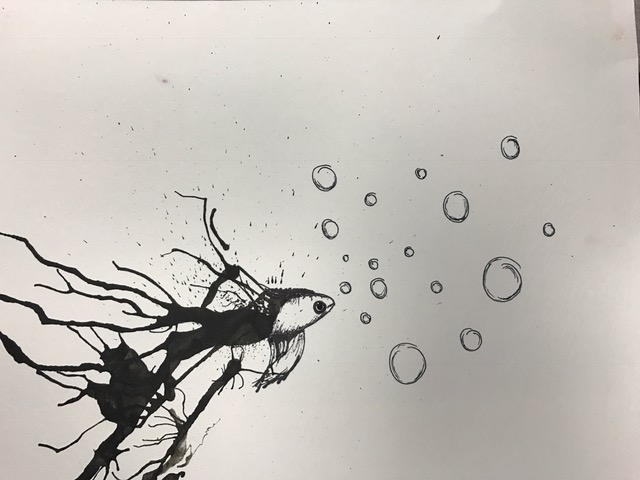 Yay for inktober! I absolutely loved my experience with ink! It taught me a lot about finding a different perspective and searching for what you may not see. After watching the fascinating Daily Monster videos, my mentee and I got to work. After spreading the ink, it reminded me of the tail of a beta fish. From there, I started to create the body by incorporating some of the speckled texture already on the fish. My mentee Cassie made a snail and I was able to guide her in the shape of the shell. It can be frustrating sometimes when you know what you want to do but you are not sure how to do it. I am glad I could help her because I know how it feels. This piece taught me a lot about how to be patient and work hard to achieve the desired outcome. I hope to work with more ink in the future.
 My mentee is awesome! Cassie is an Art 1 student very interested in sculpture and ceramics! She is already learning how to add value and make her pieces better and better. I was able to give her advice on her current still life painting and talk to her about art. I appreciate such a talented mentee! Her blog is cassie-apex-2019.weebly.com check it out!
|
AuthorJust make art. Archives
January 2017
Categories |
 RSS Feed
