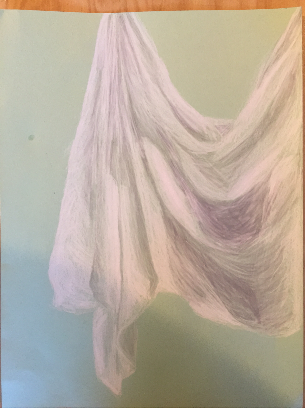
 This is a prisma color fabric drawing on green paper. I really enjoyed drawing this!
0 Comments
1. Did you use a wide range of values? Explain how is this evident.
In my fabric drawing I used a wide range of many different values. For the highlights and spots where the light hits the fabric directly I used a bright white that I used firm pressure to create the effect. For mid tones I used lightweight white prisma color and light grey shades for darker mid tones. For the deep shadows I used heavy grey colored pencils to create the look of a lack of light in that area of the fabric. I also used value to show the bends and curves of the fabric. 2. Explain how your knowledge and creating practice studies with value contributed to your piece. Since I was able to practice first I was able to pick the correct pencil for me to use. I was also familiar with regular pencils so I chose prisma color to get myself out of my comfort zone. Keeping the charcoal from getting extremely dark was very hard for me so it helped me narrow my choices. I really liked the way the white popped against colored paper which is why I chose the green background. By practicing in fabric studies I was able to fully understand the values of the fabric and also where I can improve and where I have strengths. 3. Describe the blending and transitions in your fabric To create my piece as I said I used both white and gray colored pencils. Pressure with white made it brighter and with gray made it darker. Mid tones light white and gray to create the look of flow. It took me quite a while to blend the colors just right to get the right shape of the fabric and I think in the future I could improve my blending skills. I tried to use lines in the same direction so that the flow of the fabric would still be there. 4. Explain how your interpretation of texture is essential in capturing the look of the object. I interpreted the texture of the fabric to be both smooth and a bit of a worn soft look. This is important because it affected the values and blending I used. I also used a tight cross hatch in some areas to give that worn look. My lines also kept a smooth and mostly continuous flow to allow for blending and texture. The way the texture is drawn also can help create a more 3 dimensional look to a drawing which I tried to incorporate. 5. If you could recreate your pieces what would you do differently to enhance the final outcome? Well first of all I definitely would have done a better job getting those in between values in my charcoal piece. I nailed the darks and had some good light spots but not much in between. Next I would have created a sharper edge to my pencil fabric drawing, I feel like that would have given my art dimension and a neater quality. I also wish for my final I had blended the gray better because you can see the lines in some spots. Overall I like my art but I do not think I am very good! LOL! 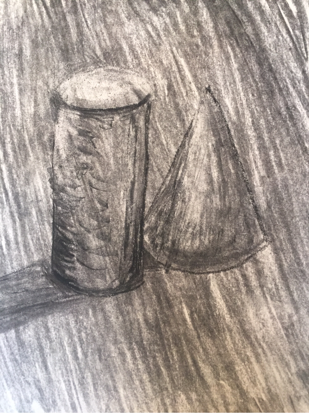 I really enjoyed drawing shapes! I could definitely be better with graduating the charcoal values if I had to improve it.
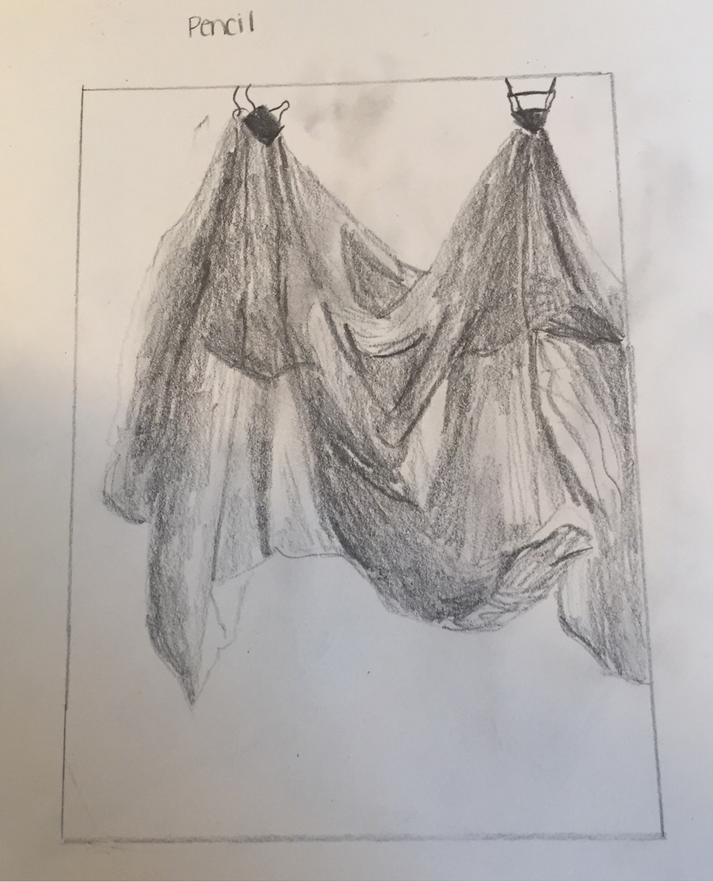 This is my pencil drawing of fabric. For one of my first times drawing fabric I'm happy with the values I got in there. 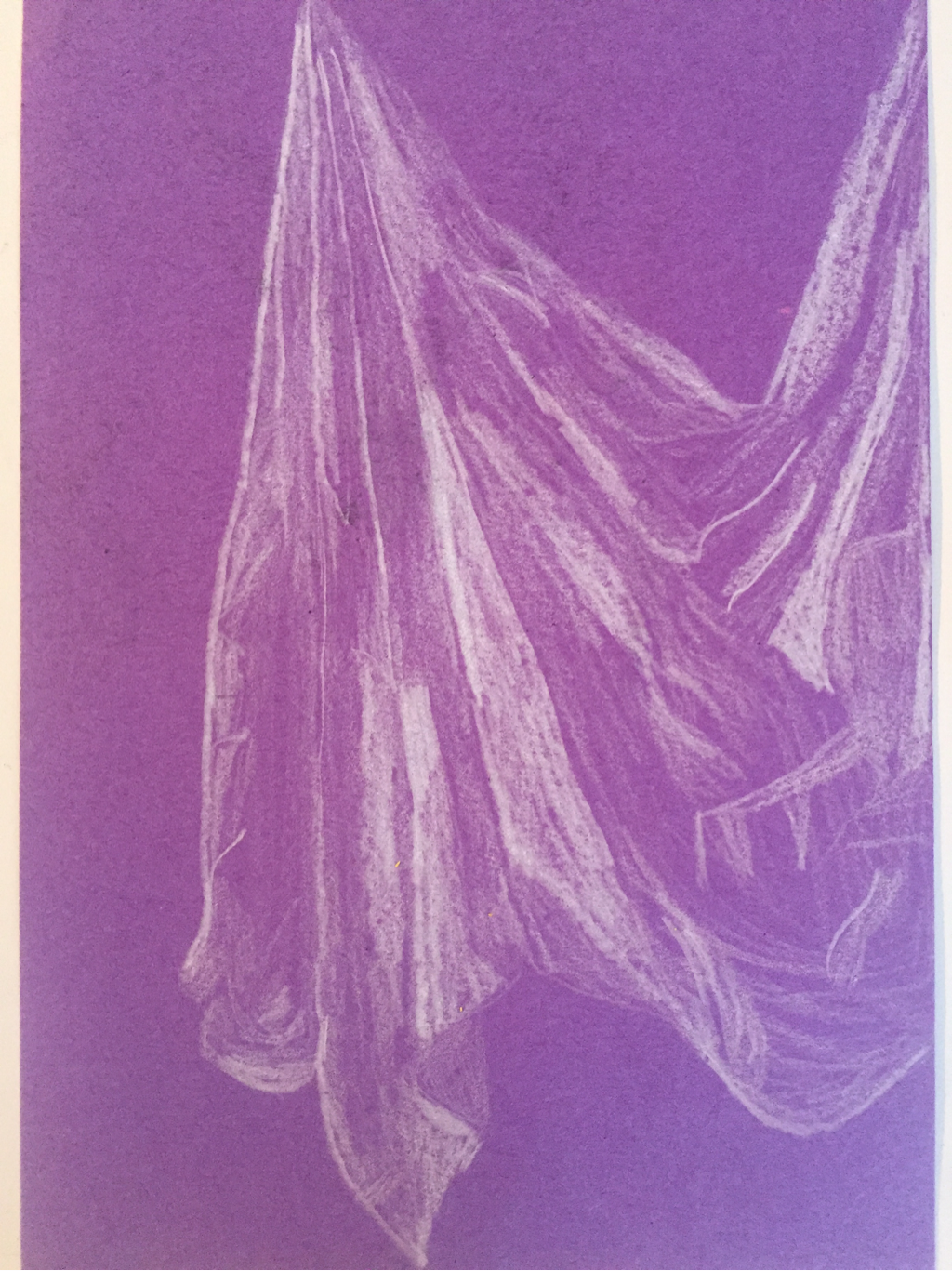 This is a prisma color fabric drawing. Getting mid tones is hard but I got the hang of it! 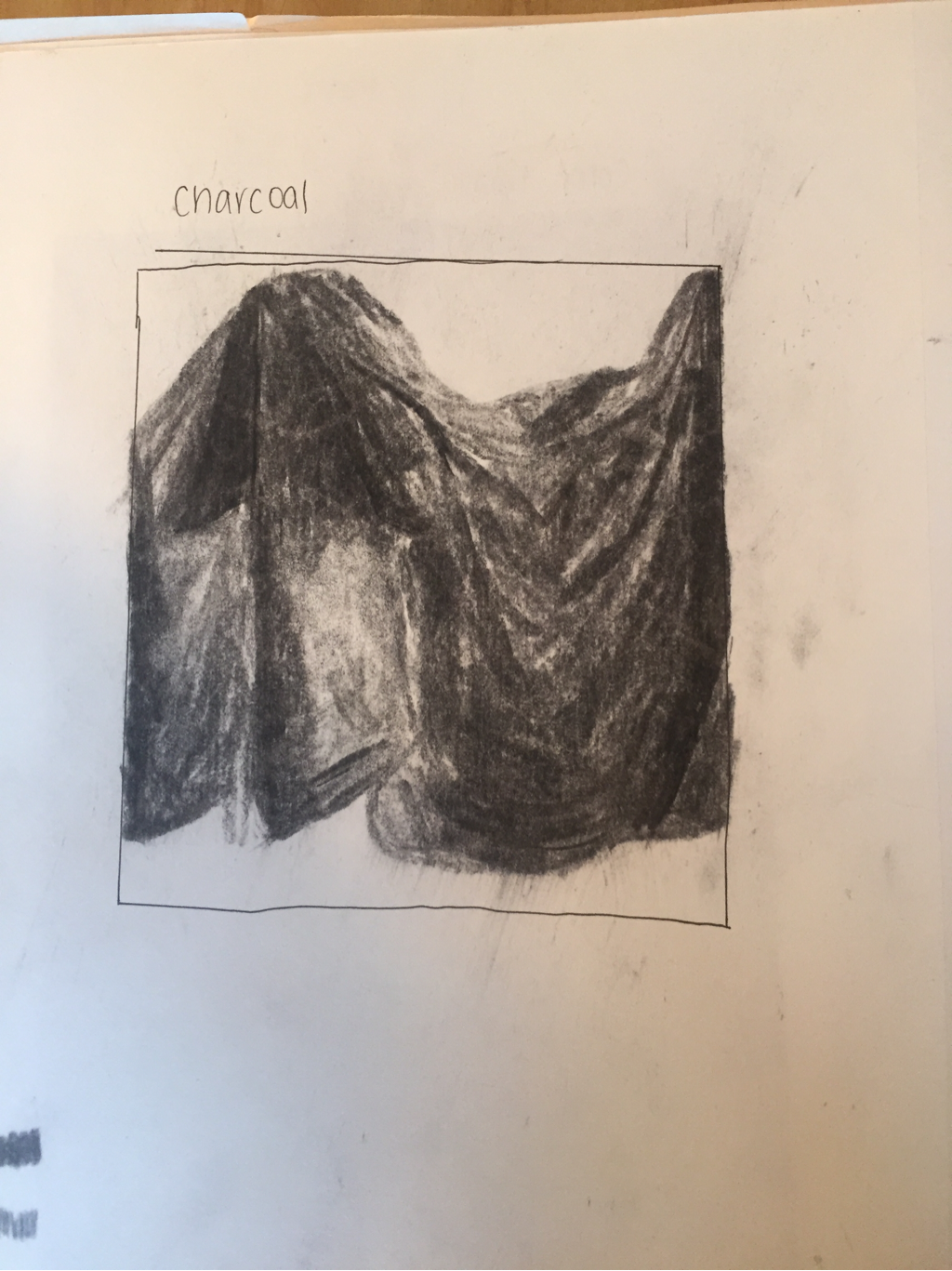 This is my charcoal fabric drawing. I think I went to dark causing a lack of highlights so next time I'm going to try a chalk pencil!
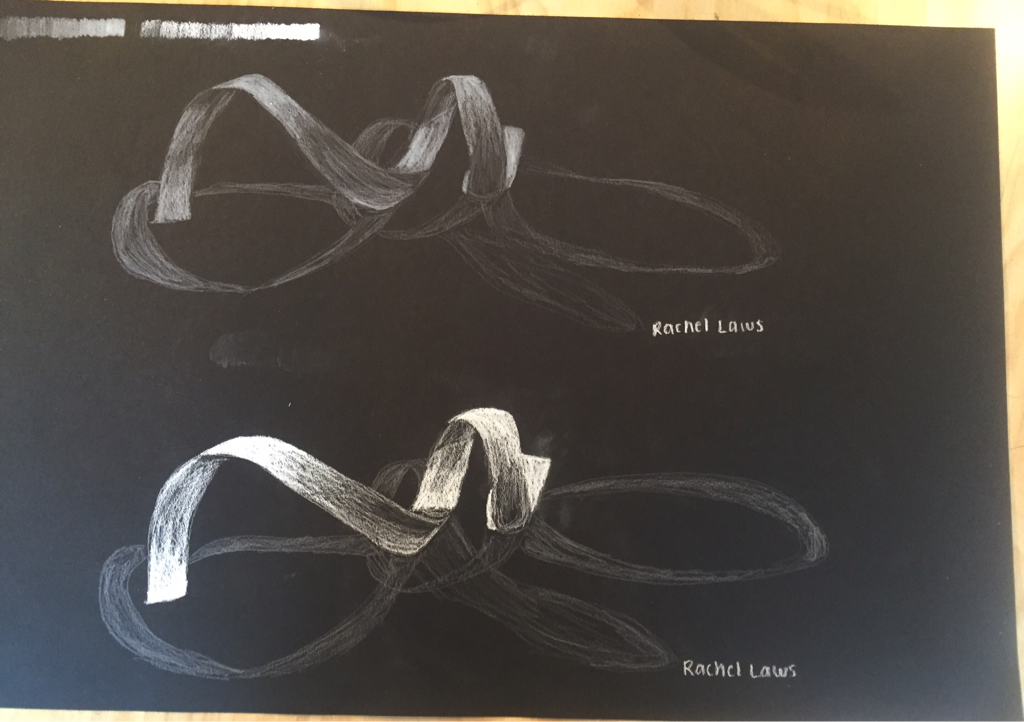 I loved drawing these ribbons! I like the highlights and overal value of the bottom ribbon!
|
RachelI am not great at art but we all try right? Archives
May 2016
Categories |
 RSS Feed
