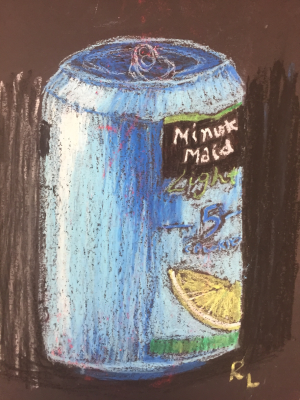
 This can allowed for an understanding of how to blend oil pastels.
0 Comments
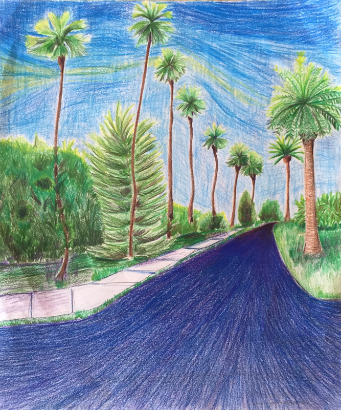 During my trip to California this summer I was able to take photos and took the inpiration photo for this art in Beverly Hills. The typical photo of palm trees down the road inspired me to draw this in that it incorporated perspective. I chose to add some greenery around the tall leaning trees but I also added a sidewalk that further increased the perspective of the art. The sky is also a unique creation that I created by blending prisma colors to add more interest. While I was drawing my road I started with the goal of coloring it in and not looking at its value and perspective. Then I started to add dark red and purple in the back and made it lighter as the road came closer. I also learned to use lines that follow down the road that allowed for proper value and shape. Just by using these vertical lines the road comes alive. I learned about shading with prisma colors by blending blue, purple and some red. Drawing this road increased my knowledge of perspective and value and how they work together. This was my first true final drawing with prisma colors. Before I had only experimented with them but I thought doing a landscape would be a good time to start. I also used the prisma to make darker colors than I usually do. I feel that this paid off in that the tree and the road had a new dimension and more interest in the darker points. I was weary of the outcome but I feel the colors really helped my drawing stand out. 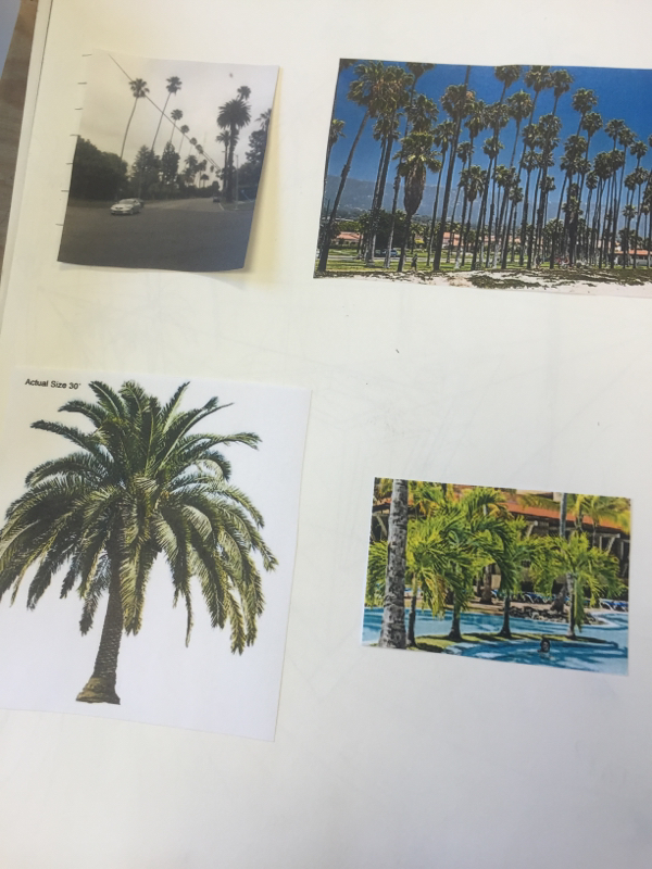 I used these 4 photos to plan my drawing. Each helped me understand perspective angles, value, and shape. 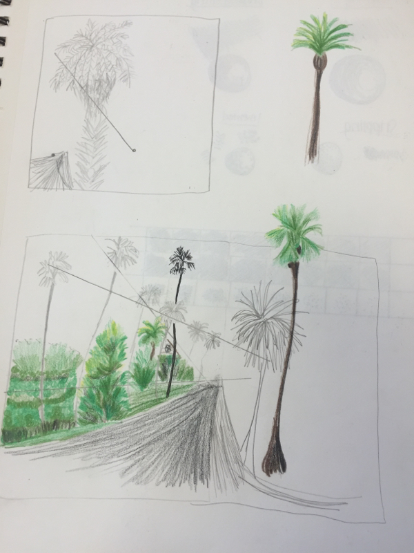 These thumbnail sketches helped me draw out the perspective and get a basic idea for my drawing. Even though they are disorganized they allowed for me to understand the basic design I am planning. 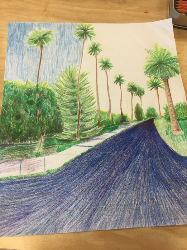 This is my the progress I made on Friday. My basic perspective elements are in and only details and value are left. In the beginning of art, I had some knowledge of art but I mainly understood acrylic painting. When I originally choose water, I had no creative inspiration besides simply a drop of water. The colored pencil piece I mad did not have proper proportions that added interest. It was overall very underwhelming. While the remake of the theme I used a mixed media of water color and prisma colored pencils. I was able to add vibrant colors and more detail which better highlighted the water theme. Using the rule of thirds also added a unique perspective that also made the water stand out. The major differences in these 2 pieces show a growth in taking a theme from drab to fab! I also believe my attention detail has dramatically improved. I also chose to incorporate more value which I have learned to use. From beginning to end, my interpretation and skills of theme in art have become much better. 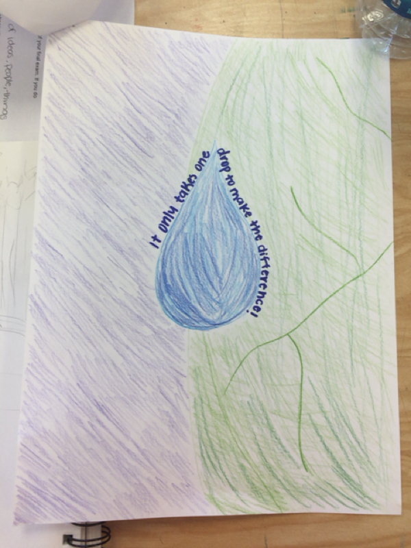 In the beginning  In the end For my Snoopy piece, I chose to use colored pencil and sharpie. The colored pencils allowed for a light look that allowed for beautiful colors. I chose colored pencils due to the colors involved and attention to detail. The sharpie allowed for a sharp cartoon look that I was aiming for. These medias allowed for a cartoon look with plenty of detail and showed the feminine look that I was going for. Overall the choices allowed for a realistic attention to detail that incorporated a female version of the classic Snoopy we know 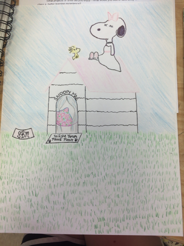 Snoopy girl in colored pencils and sharpie In a very different landscape piece my media choice was watercolor. I enjoyed using watercolor for this piece in that it allows for lushess landscape and sky. The watercolor allowed for a blending of colors to show shadows and dimension. The watercolor gave a peaceful vibe to the painting. By choosing this media, the piece was able to be realistic and show the natural idea. 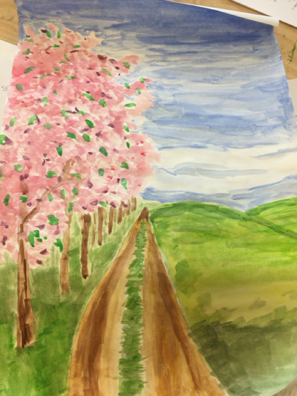 Cherry Blossom Countryside This year in art has been great! I have thoroughly enjoyed many aspects of projects and warm ups. My favorite project would have to be the identity project because it truly changed my perspective. I also like when we drew the horse upside down for a warm up. It allowed for me to look a the lines not the actual horse. It also helped me draw based on negative space. One thing I would change is more practice with colored pencil. Although it takes quite a while, I feel it would have helped improved my skill set with this media. I enjoyed having no homework I have to say! This class was good! My idea came about for this art project due to the fact that it was spring. I was scrolling through the Pintrest when I came across the perfect idea: a cow. From there I complete a sketch and when on to create my cow. I then stuck with the farm theme and created a pig and chicken. 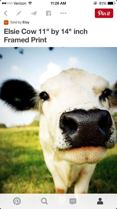 The cow that first sparked my interest. 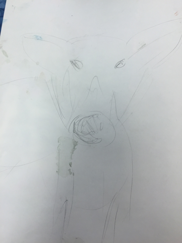 My pig sketch The farm animal theme inspired my series of art that I created. I was also inspired by the colorful paintings that some artist had created. This is what gave me inspiration to use a "messy" style of painting. I believe with the shading and pink background that this cow is unique. In my chicken painting, I started with a white chicken then used a fan brush to give the feathers a textured look. My overall farm inspiration was then twisted with a messy brush stroke style to create a new art that I have never attempted! I love it! 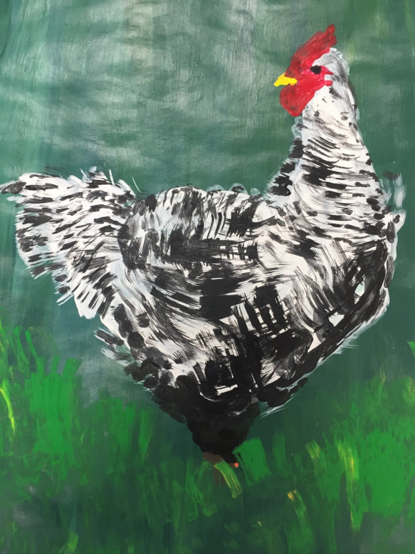 The black and white hen! 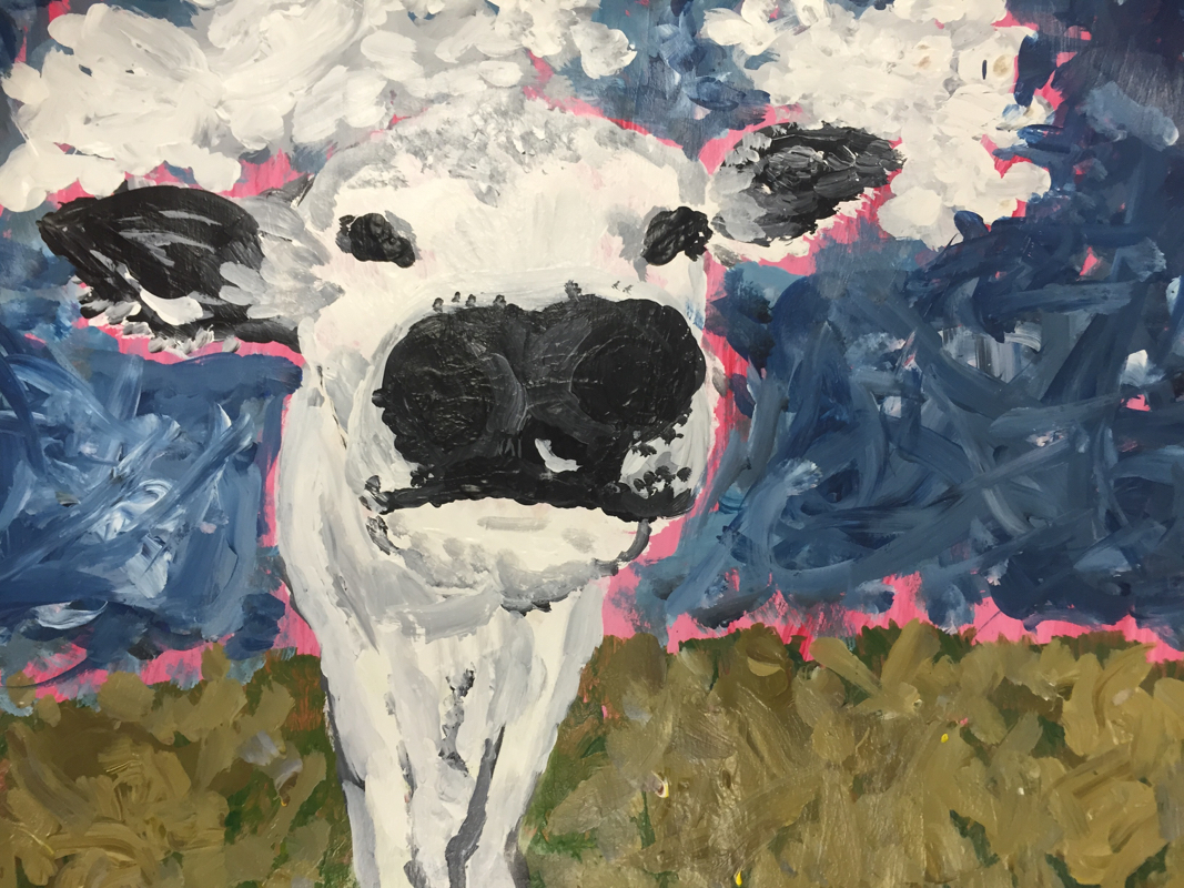 The messy cow! 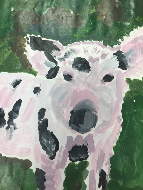 The piglet! Creating my own project was definitely a challenge but I once I found an idea it was great! I enjoyed having choice but I wouldn't like to be this unguided all the time in art. Structure is a good thing to have at times so that a starting point is given. But I also like having free choice in that it allows a large array of creativity! Choice is good to a certain extent. 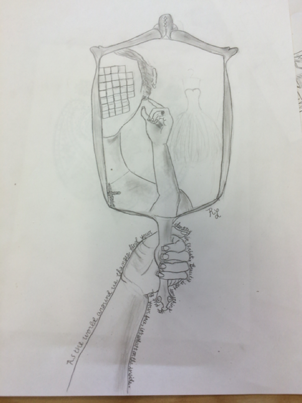 The artwork I chose to draw is about changing identity. Small details in the photo show how true identity does not change. The girl in the photo is getting married as seen by the engagement ring and faint outline of her dress hanging in the background. A cross hangs from her neck representing how some of her identity is changing but her faith in Christ is steadfast. I also chose to blur her face because so much of our identity is seen in "putting on their face" with make up when really it's on the inside that counts; faith. Faith is a very important aspect of my life which is why I chose this interpretation. 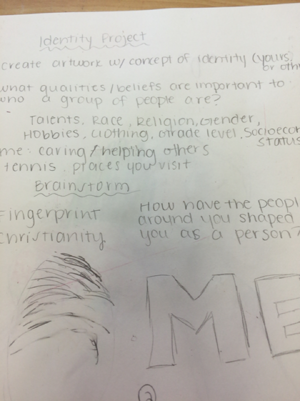 My first planning process was brainstorming questions and ideas 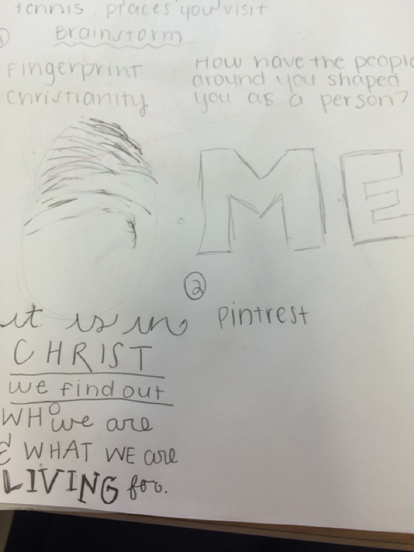 My second planning process was Pinterest where I found photos and inspiration 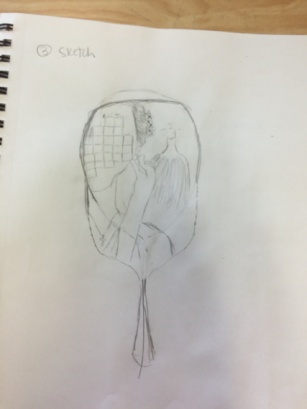 Finally, I drew a sketch of how I wanted my artwork to look. In my piece I used a media of pencil in order to display my desired effect. This media allowed for a more realistic looking person in my drawing.I used the pencil to highlight the aspects of identity such as the cross and the blur over her face. The dress was able to be faded into the background and show the woman is a bride without making it too dramatic. I was able to add value and bring the drawing from flat to 3 dimensional. I also included text around the handle of the mirror. This text helped convey identity and the points I was trying to make through my artwork. It almost worked as a caption to my work. I believe the media I used was the best way to capture identity. 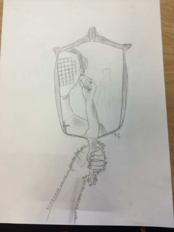 I first off wanted to say I really enjoyed the opportunity to learn more about art with photography. These photography excursions made me think a lot more about taking a photograph. I choose this photo because it truly represented me. When I first took this photo I was going for a reflection that represented a portrait without a face. When I looked at the photograph I was amazed to find a cross in background which represents my faith. I incorporated nature with the trees into the top third then the cross, then my face in the right corner. I feel like the composition gives this photo a uniqueness. 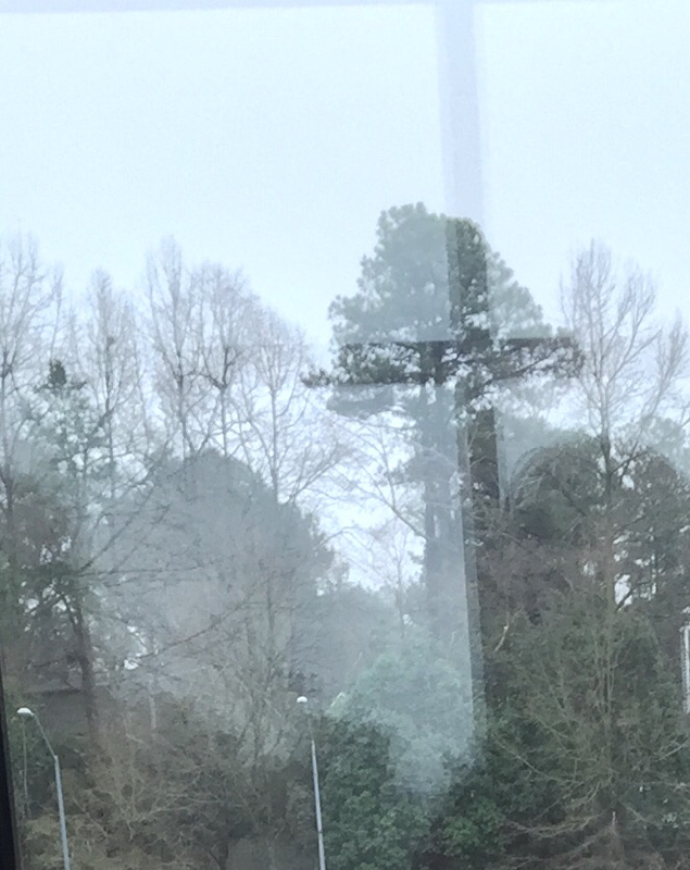
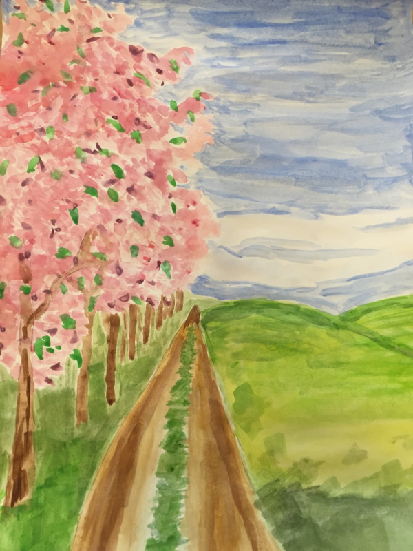
This watercolor painting presented a multitude of challenges and successes. I had a hard time painting the path because it faded off in the distance but then I realized the skill of a vanishing point which we learned in drawing. I was then able to have proper proportions. Also, it was very hard to paint the shadow of the grass and have it blend with the lighter grass. I then was able to use the technique of adding water to blend the colors. By using watercolors I was able to use and understand more about painting. |
RachelJust a girl in art class. Archives
September 2015
Categories |
 RSS Feed
