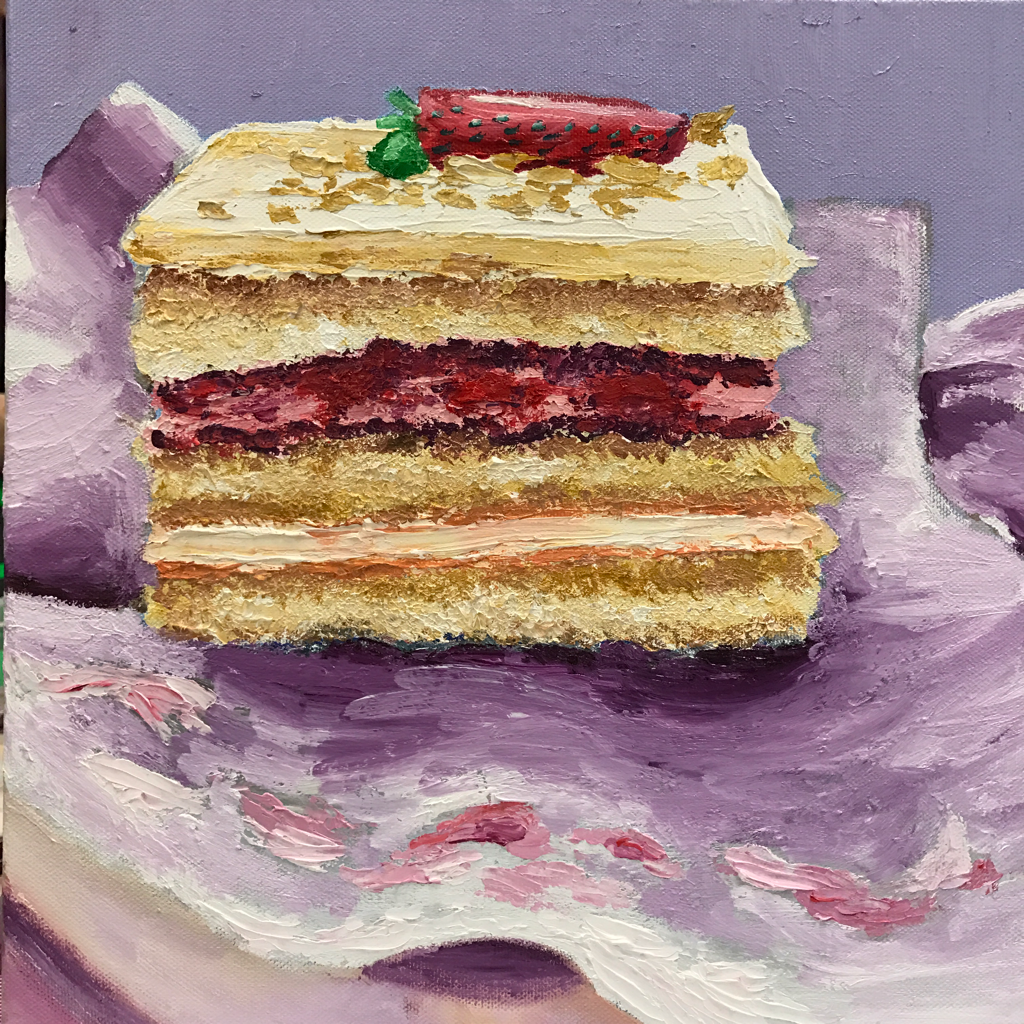
 This is my updated painting where I used more mauve! I think this works better and keeps the color scheme more uniform. This is the process I used to create my oil painting. My inspiration came from my trip to California, where I ate this shortcake at the famous restaurant Porto's. This shortcake took a lot of time and experimenting. I had never made an oil painting before this so it was kind of scary. I started out by creating the shortcake. I wanted to get a cakey texture so I used a pallet knife. This created a focal point. I then added value to make the cake appear more realistic. The background was a huge obstacle. Trying to paint fabric with oils was a new experience. I started out with too much blue in the shadow so I had to completely repaint it. This was for the better because the wrapper has a better shape. I think the color choice was good but I would have added more mauve in the cake shadow on the wrapper if I could go back. I think by adding frosting to the wrapper there is added interest in the piece. If I could paint this again I would try to tie in the green of the strawberry elsewhere. I would also continue with more values in the fabric and plate. Overall, I am excited about the way this piece turned out and I am thrilled to try out oils again.
0 Comments
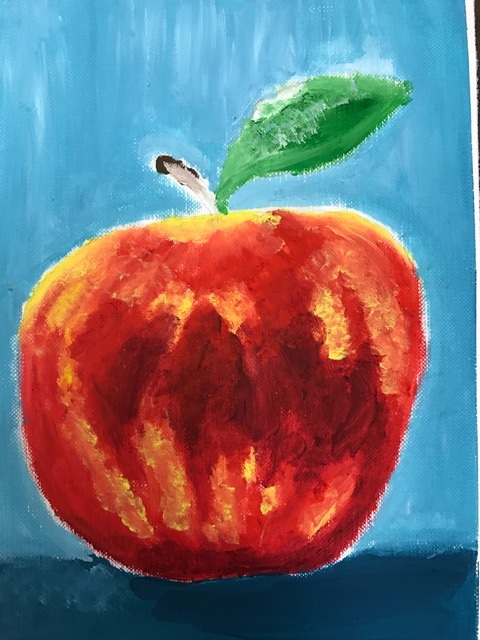 This is my apple I made using oil paints. This was my first time using oil paints so I found it really challenging. I like the texture I got with the apple but I would really like to get a smoother look in my future oil painting projects. I like the way the oils take a while to dry so you can continue to experiment and move around the paint you just do not want to create "mud". I am not used to the lighter colors disappearing into the darker colors so that is weird. Oils are cool but definitely out of my comfort zone.  I found the palette knife to be a way better method for me to paint oils with. I like the texture it gives and I feel like I can blend better. I love this apple because of the green contrasting the purple and the values in it. The palette knife is such a cool way to paint and I hope to use it during my final project.
My oh my was this a hard piece. This is a prismacolor drawing of me opening the door to my home. This is significant because home is where I can rest and be comfortable. I have also lived in the same house all my life so this reflected a large piece of my identity. I have very minimal experience using prismacolor pencils; this was only my second piece that I completed with these pencils. I learned a lot about how to use prismas properly and I developed my own style by incorporating multiple techniques. I choose a color scheme that had a lot of cool colors but I used red tones to create vibrant highlights. I also did not use black, instead I used a deep blue and blue violet. I really like the way I used colors in the lock and door knob to create a sense of reflection the area around the door. I exaggerated the colors immensely and used many different values. I have both smooth parts of this drawing such as my keychains and the door knob and lock, but I also used rough lines for the door and door frame. If I could change anything, I would continue to add color and smooth my lines. I am overall happy with the end result! I impressed myself!
|
AuthorJust make art. Archives
January 2017
Categories |
 RSS Feed
