|
First off, I totally love drawing people. It is such a great challenge and every time I seem improvements in my art skills. For this piece, I was inspired by a peacock feather. Taylor had one at her house so I used it. I wanted to create the illusion of it being like my eye but not directly over my eye. I think the pop of color is a great way to add interest in this piece! I think by doing this the piece had more interest. I started by adding light layers of graphite to make a smoother range of values. I chose to make my shirt very dark to display the wide range of values in graphite.
I chose graphite as my medium of choice because or its wide range of values. I love the way that a simple pencil drawing can be transformed by spending time and energy to create a worth-while piece. This was my first graphite piece since drawing class, so I was excited to get back to working with it. Although many people say graphite is a "safe" medium I would beg to differ. Graphite can be irritable and make lines across your drawing and smear. It constantly takes your time to make it look as clean as possible. Also, a lot is expect out of you using graphite just because of the common quality of it. The prisma colored pencils were also used and took some experimentation. I was not sure how the color would lay over the pencil so I tried to be very soft with graphite then go back and add the colored pencil. It was so hard to add dark values where my eye is under the feather without mudding up the vibrant colors of the peacock feather. As far as my face, I think it looks so much better than my drawing portrait. I feel like I did a better job with the hair.I could do probably add more value to the hand to make it more dynamic. There could probably be more values like anything, but I see improvement. The rough values are kind of a style I am developing as my own and that is cool to see in the works. I feel like the background works really well to create the feeling of being outside without taking attention away from my face in the foreground. I also like my composition and they way my head is tilted. I would love to draw more people sometimes, it is scary but is super rewarding in the end!
0 Comments
This piece was inspired by my passion for food. I chose to paint this in acrylic because I have not used it in a while. I love the detail and perspective of this piece. I also like the values of the cereal boxes that you normally would not see just looking at the picture.The pantry itself is very dark. I had to lighten up the boxes and add colors to make it more dramatic. I love the bright primary colors throughout this entire piece. Getting the box shapes was really hard. The cool thing about this piece is I feel like more can always be added. If I could do the piece again I would add even more shadow underneath the boxes. This interior spaces project showed me I can do stuff I am not comfortable with and make it look good. I really enjoy making labels and working with details even though it scared me so bad!
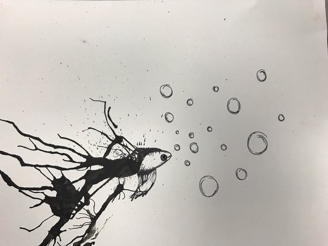 Yay for inktober! I absolutely loved my experience with ink! It taught me a lot about finding a different perspective and searching for what you may not see. After watching the fascinating Daily Monster videos, my mentee and I got to work. After spreading the ink, it reminded me of the tail of a beta fish. From there, I started to create the body by incorporating some of the speckled texture already on the fish. My mentee Cassie made a snail and I was able to guide her in the shape of the shell. It can be frustrating sometimes when you know what you want to do but you are not sure how to do it. I am glad I could help her because I know how it feels. This piece taught me a lot about how to be patient and work hard to achieve the desired outcome. I hope to work with more ink in the future.
 My mentee is awesome! Cassie is an Art 1 student very interested in sculpture and ceramics! She is already learning how to add value and make her pieces better and better. I was able to give her advice on her current still life painting and talk to her about art. I appreciate such a talented mentee! Her blog is cassie-apex-2019.weebly.com check it out!
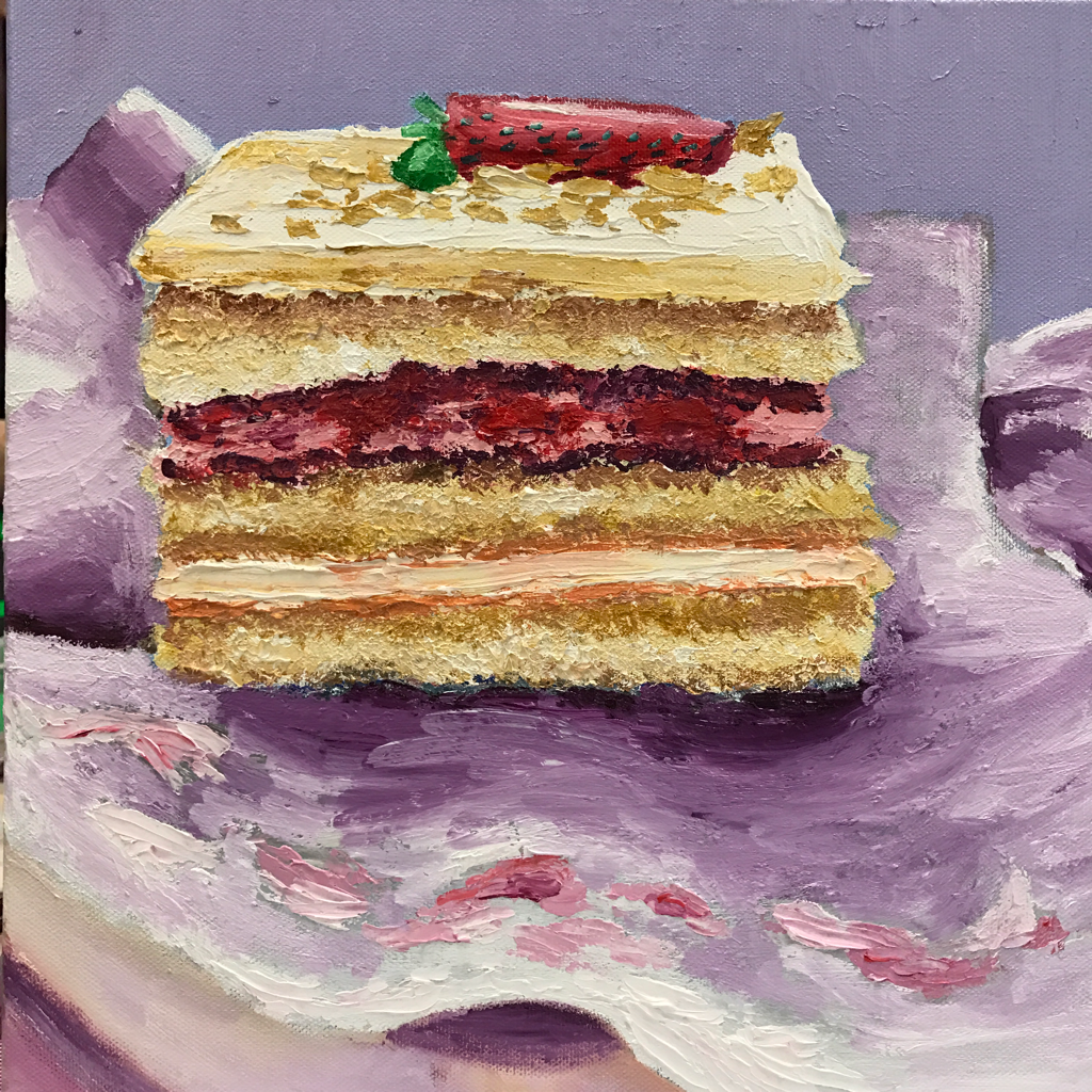 This is my updated painting where I used more mauve! I think this works better and keeps the color scheme more uniform. This is the process I used to create my oil painting. My inspiration came from my trip to California, where I ate this shortcake at the famous restaurant Porto's. This shortcake took a lot of time and experimenting. I had never made an oil painting before this so it was kind of scary. I started out by creating the shortcake. I wanted to get a cakey texture so I used a pallet knife. This created a focal point. I then added value to make the cake appear more realistic. The background was a huge obstacle. Trying to paint fabric with oils was a new experience. I started out with too much blue in the shadow so I had to completely repaint it. This was for the better because the wrapper has a better shape. I think the color choice was good but I would have added more mauve in the cake shadow on the wrapper if I could go back. I think by adding frosting to the wrapper there is added interest in the piece. If I could paint this again I would try to tie in the green of the strawberry elsewhere. I would also continue with more values in the fabric and plate. Overall, I am excited about the way this piece turned out and I am thrilled to try out oils again.
|
AuthorJust make art. Archives
January 2017
Categories |
 RSS Feed
